There is an interesting article in the New York Times on the pattern of health expenditure and longevity in the U.S. The author's thesis is that both were about the same as in other developed countries until 1980 and that since then expenditure has grown much faster and longevity more slowly than in other countries. The author runs through a considerable number of possible explanations while ignoring what seems to me the most obvious one.
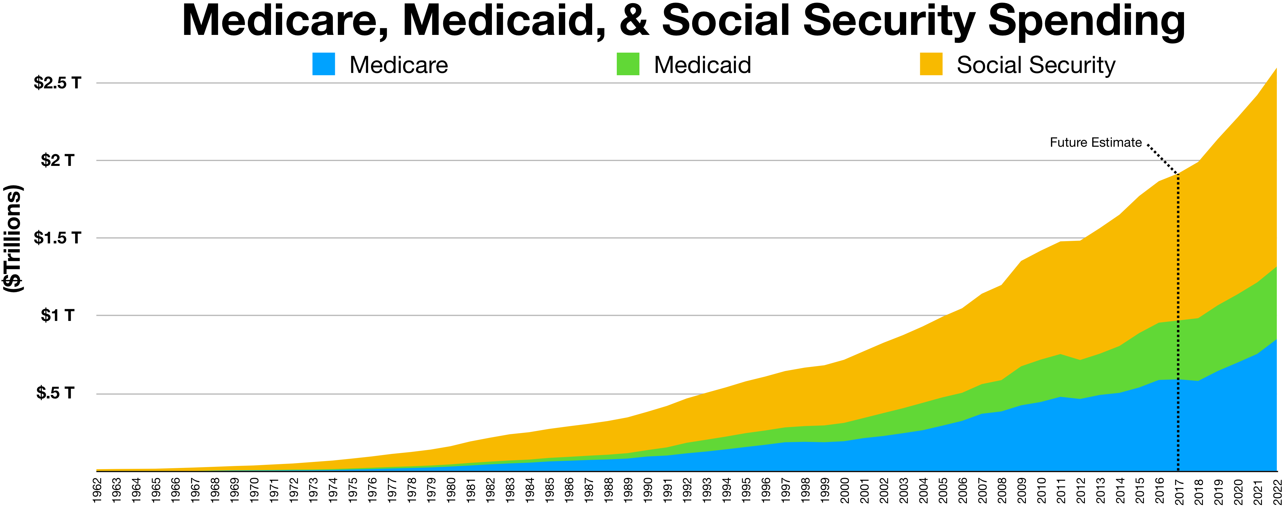
Medicare and Medicaid were passed in 1965, went into effect in 1966, with expenditure initially small but gradually increasing. Currently, their sum is over a third of all medical expenditure. I am not certain that that is the main cause of the increase in U.S. health care costs, but it fits the timing pretty well.
A health economist writing for the New York Times does not even consider it as one out of his many possible causes.
12 comments:
By the way, Scott Alexander also has a nice blog post on "the cost disease" where he takes a look at health care's rising costs as well as those of other industries.
What's the comparable timing under which the European country's health countries have turned to greater socialism? In order to blame medicare and medicaid, we'd have to show that the government underwritten care in those countries wasn't also increasing at a similar rate.
Chris:
The NHS in the U.K. was established in 1948; I don't know about the other developed countries. The U.S. went from almost no government provision of health care to about half of health care being paid for by government (medicaid and medicare add up to 37%, but there are a number of smaller things as well).
Googling for information on Sweden, I find:
"Sweden first looked to adopt a national health insurance program in 1946 with the passage of the National Health Insurance Act.The plan was not initiated until 1955, and it called for universal coverage for all citizens funded primarily by the government through local income tax revenue where the control of health care is primarily in the hands of the county governments in Sweden. "Doctors could still have a private practice, although by the 1960s about 80 percent of doctors worked in government-run hospitals.""
The difference seems to me to be that in the US the population has somehow come to expect that health coverage is a blank check, even "free" healthcare provided by the government. Look at the reaction to Obama's attempt to create some sort of review of what should and should be covered. the NS for example is much, much tougher about what they will and won't pay for, but nobody in the UK goes on about "Death Panels".
Steamboat:
One interesting question is to what degree different national cultures affect how well different institutions will work.
To evaluate the question of causation between Medica* and rising health care costs, one would look at the health-care-cost graphs before and after Medica*. Unfortunately, the Times article doesn't provide that.
The second graph, of life expectancy by year, only starts in 1980, so it can't possibly show us anything changing in 1980, much less in 1965. It does show (as the authors say) that the U.S. was "in the middle of the pack" in 1980 but has gradually fallen to last place among the 22 developed nations (named in the footnote) included in that graph.
The first graph is a scatter plot of life expectancy vs. health care costs from 1970-2003 (I don't know why it stops at 2003), but if we assume health care costs have been monotonically increasing, we can treat it (for any given country) as having time on the X-axis. There are exactly 10 U.S. dots to the left of the one labelled "U.S. in 1980", consistent with that assumption. This graph does show a bend around 1980 (or more precisely 1982), since which the life expectancy/spending slope has been substantially lower than in the other countries included in the graph. We don't know what countries those are: not the same set as in the second graph, because by this graph, the U.S. was already near the bottom for life expectancies by 1980.
The graphs I'd like to see are health care spending (either total or per capita) and life expectancy, each against time. You would think that would be easy to find on the Web. I went to the Centers for Medicare and Medicaid Services and downloaded "NHE Summary including share of GDP, CY 1960-2016 [ZIP, 28KB]" which includes every year from 1960-2016. Aggregate and per-capita graphs don't show much except a maybe-quadratic growth rate, with a slightly lower slope from 2008-2013 than before or after that period. The first derivative of per-capita health care spending was more interesting: rising steadily from 1960-1978, rising faster from 1978-1981, falling from 1981-1985, rising from 1985-1989, falling from 1989-1995, rising from 1995-2002, falling from 2002-2012, rising rapidly from 2012-2014. To the point of the Times article, I don't see much of a bend upward around 1980. What I do see, starting around 1980, is more and more dramatic swings in the graph, perhaps because health care spending became a more partisan political issue, and/or because Federal-government health care spending had become a large enough fraction of the whole by this time that Federal political cycles became visible in the graph.
But let's pretend we did see a clear bend upward in the health-care-spending graph around 1980. Could this plausibly be a result of Medica*'s passage fifteen years earlier? There are a couple of ways this could happen, although it takes some stretching. First, if there were some major change in Medica* rates, coverage, premiums, etc. in the late 1970's, it would still be Medica*-related, though not tied to the original passage. Second, if there were a consistent rise in per-capita health care costs around age 80, and if more people survived to that age as a result of Medica*, then the first wave of people thus affected would be hitting age 80 around 1980.
The latter is plausible, as the first graph in the article shows U.S. life expectancy rising rapidly from 1970-1982. It also shows that by 1970, U.S. health care spending was already higher than in most other developed nations, and we were already getting less life expectancy for our buck than most other developed nations, although both of those facts became more dramatically true since 1980. It would be very interesting to see whether those two facts were already true by 1965.
Don't medicare & medicaid pay out at lower rates? So if I'm a surgeon and I take out a gallbladder from a patient with Medicare, I get $150; whereas, if I take out a gallbladder from a patient with private insurance, I get paid only $150. The removal of the gallbladder is independent of the insurance that the patient has. — SJA
IGNORE MY LAST COMMENT. I MEANT TO SAY THE FOLLOWING:
Don't medicare & medicaid pay out at lower rates? So if I'm a surgeon and I take out a gallbladder from a patient with Medicare, I get only $150; whereas, if I take out a gallbladder from a patient with private insurance, I get paid $300. The removal of the gallbladder is independent of the insurance that the patient has. Therefore, how can Medicare and Medicaid taking up a larger percentage of total expenditures explain an increase in the total expenditure? — SJA
I wasn't proposing that as an explanation for an increase in total expenditures, but rather as an explanation for an increase in variability.
If most medical decisions were by individuals, or by a large number of insurance companies in competition, you might expect all the temporal variations in those individuals or companies to average out to something fairly smooth over time. If, on the other hand, most medical expenditure decisions were made by a handful of Federal government agencies, you would expect the totals to change every time the political winds in Washington shift. An HHS director appointed by President Warren will make very different policies from one appointed by President Pence.
For that matter, if most medical expenditure decisions were made by a handful of large insurance companies that have found ways to avoid actual competition with one another (because it cuts into profit margins), their implicit communication would make them act like one enormous company, and the totals would change every time this pseudo-company made a policy change.
I'm pretty sure both of those things have actually happened since 1970: more health care spending passes through the Federal government, and more health care spending passes through fewer larger insurance companies that compete with one another less and less. Either or both of those phenomena could explain the increased variability.
We don't have a free market for healthcare. Which is a good thing, insofar as we don't let poor people die in the streets.
But it also means there's less incentive to produce a cheaper product for a larger customer base.
Which ties in with your theory, more or less.
I don't know anything about American health care. But if Rev Les Crowley comment is true, then we should see essential healthcare costs rising and non-elective healthcare stagnant. I am assuming that the US government pays for "people not dying on the street", but does not pay for breast implants. If this is the case, then it suggests (but does not proof) that indeed government-control is inflating costs of those areas.
The state numbers are interesting. They vary widely enough that it makes me think it is a state regulation problem:
https://www.kff.org/other/state-indicator/health-spending-per-capita/?currentTimeframe=0&sortModel=%7B%22colId%22:%22Health%20Spending%20per%20Capita%22,%22sort%22:%22asc%22%7D
Utah and Arizona do so much better than Massachusetts, Vermont and Delaware.
Post a Comment